
Chart Widget
An interactive chart. Currently we support line, row, bar, pie, and donut. You can also embed a custom chart created outside the editor.
Watch video:
- Click on the plus button at the left top corner.
- Expand the Charts section and select the desired Chart widget.

How to adjust the Chart widget?
- Locate the Chart Settings button with the gear icon in the properties panel on the right side. Click on it.

You can find all the available settings for the Chart here.

How to add your values to the Chart?
- Go to Chart Settings.
- Locate the Data section.
- Input your data into the appropriate cells here.

- Or switch to the fullscreen view of the table by clicking on the expand button at the top right corner of the section.

Additionally, you can import your data from a CSV document or from Google Sheets.

Chart Style

- Animation. The Charts widgets have animation by default when you scroll to them. This toggle enables/disables this animation.
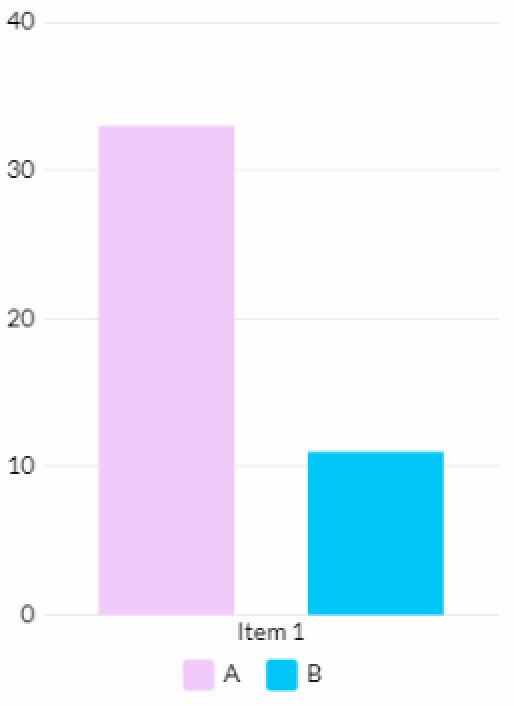
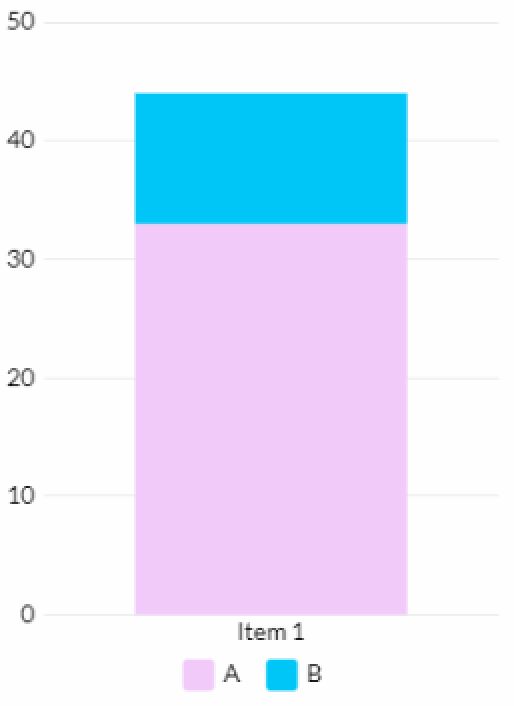
- Stacked. By default, bars are placed separately on the widget. This toggle stacks them into one bar.
Legend and Labels

- Legend. Legend is a block that allows you to hide or unhide the chart's pieces, such as bars, lines, pie slices, and donut slices. The Legend option controls visibility and location of this block. There are 5 options available:
- None - hides the Legend block.
- Top, Bottom, Left, Right - the Legend block will be placed in the corresponding location based on the selected option.

Watch video:
- X-Axis Title and Y-Axis Title. This toggles enable the titles located below or to the left of the charts.

- X-Axis Labels and Y-Axis Labels. This options control the display of labels located below or to the left of charts. There are 4 options of display available:
- None - hides the labels.
- Auto - the chart labels rotate when the widget width is scaled down.

- Auto Fit - The labels are distributed across the widget's width and no text transformation occurs. Additionally, this option allows you to control the labels angle (X-Axis Lable Angle). There are 4 options available - Left Vertical, Left Diagonal, Horizontal, Right Diagonal, Right Vertical.

- Show All - the labels' text is transformed according to the vertical text layout by default. Additionally, this option allows you to control the labels angle (X-Axis Lable Angle). There are 4 options available - Left Vertical, Left Diagonal, Horizontal, Right Diagonal, Right Vertical.

Please note: Some labels may be hidden if the widget width becomes too small.
- Y-Axis Format. This option controls the format of the numbers located to the left of the charts. There are 5 formats available:
- Number
- Currency
- Percentage
- Number With Comma
- Compact Number
- Y-Axis Custom Format. Here you can input your custom format.
Chart Bar

- Gap between Columns. This option adjusts the chart columns.
- Gap between Sets. This option adjusts the gap between the column sets.
- Rounded corners. This option adjusts the roundness of the corners of the bars.
- Outside Corners only. This toggle restricts the corner roundness to only the top part of bars.
Axis

- Gridlines X and Gridlines Y. This option adjusts the style of the horizontal and vertical lines on the background.
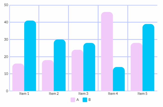
Chart types
There are 5 chart types available. Above, settings for the Bar chart type were presented. In general, all chart types have similar settings.However, some settings may differ, and below you can find those variances.
The Bar and Row chart types have the same settings.


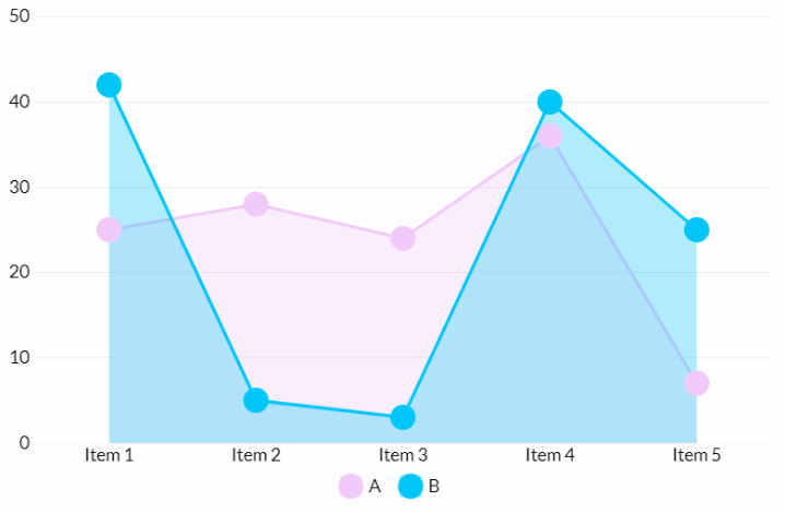
Line


- Fill. This toggle enables the color fill under the lines.

- Data Symbols. This option enables the symbols located on the chart peaks. There are 3 styles available - Circle, Rectangle, Triangle.
Donut
Chart Style


- Semi-Circle. This toggle enables the semi-circle display mode.

- Rotation angle. This option allows you to rotate your donut chart.
- Inner Radius. This option adjusts the radius of inner circle.
Legend and Labels
The Donut chart type has additional options in the Legend and Labels section.
- Leader Lines. This option enables the display of lines pointing towards the labels.
- Label Orientation. This option controls the placement of labels. There are 4 options available:
- Horizontal.

- Circular
- Label Inside. This toggle places the data inside of the donut chart.
- Radius. This parameter adjusts the distance from the donut's outer border.

- Radial
- Distance. This parameter adjusts the distance from the data default position.

- On Sides

Pie
The settings for Pie charts are the same as those for Donut charts, except that Pie charts do not have the Inner Radius option.
